🚲 The Wheels Weren't Turning.
🏙️ The Bicycle Rental Process Was Broken
Project Type:
Conceptual UX Redesign (based on secondary research).
A bicycle rental company called City Cycles had a problem. Their website was having more turnover and was converting less people during checkout. After reviewing the process of checking out from the user's perspective, it was revealed that the process was not clear. I dug into the details to determine the reason and resolve the problem for City Cycles.
Goal: Improve online reservation flow for a fictional bike rental service
+25% rental completion rate
-20% user drop-off
Fewer in-store traffic spikes
Improved staff satisfaction with smoother handoff

🚲 Projected Impact

“If we don’t fix this soon, we risk losing loyal riders to competitors.” — Scott, City Cycles Operations Manager
🧩 The City Wasn't Cycling The Same
City Cycles’ digital reservation process was outdated and confusing.
Users were forced to email the store to book bikes, leading to a 40% drop in online reservations and a spike in in-store queues.
Challenges Identified:
Confusing, email-based reservation flow
Lack of confirmation feedback
No calendar view for bike availability
Inconsistent mobile experience


The Original Site Design
Not much pizzazz and some unclear labeling made this site tough to use.

Early Draft
A very rough draft from a previous version of my design.
🧠 Digging Into The Details
Though this was a conceptual project, I mirrored real-world processes using secondary research, competitive analysis, and interviews.
What I Did:
Reviewed leading mobility platforms (Lime, Spin, CitiBike).
Identified UX patterns for quick checkout and confirmation.
Synthesized secondary data on micro-mobility user behavior.
What I Found:
Riders range from commuters to families and competitive cyclists.
Booking preferences differ: some prioritize bike type, others rental date.
All expect speed, clarity, and flexibility.


Card Sorting
Here is where I laid out some cards to see where the site setup was and where I could make some improvements.

Focusing On The User Needs
In order to put myself in the mindset of the user, I also laid out some of the wants and needs of the user so that I could brainstorm some ways to address the demand.
🎯 Realizing What's Wrong
Problem Statement:
Users need a simple, modern, and reliable way to reserve bikes online without relying on outdated email workflows.
Design Goals:
Streamline the reservation flow
Provide immediate confirmation
3. Support multiple user types (commuters, families, athletes)
4. Ensure responsive, accessible design

🧭 Considering What Comes Next
My initial idea was to give users two paths to reserve a bike (as seen in the sketch to the right):
Choose by Bike Type
Choose by Date Needed
Users found this redundant and confusing. Based on feedback, I simplified the flow to focus on choosing a bike first, then setting dates and details within that process.


Affinity Diagram
Some users had specific needs for their bikes that we needed to address. Such as:
1. Families with kids
2. Competitive cyclists
3. People navigating densely packed metro areas

Matrix Method
This is one of the ways I settled on the overall design for the website. Some ideas were more fun than practical.
🚲 What I Worked Out In The End.
💻 How We Got The Wheels Turning Again


Outcomes From Redesign (1)
As noted above, the redesign would help users to achieve their goal of renting a bike with less clicks and friction.

Outcomes From Redesign (2)
As noted above, the redesign would ideally increase reservations and reduce bounce on the site.
🚲 High Fidelity Prototypes.

Checkout Page
The user lands here when their bike reservation is complete.

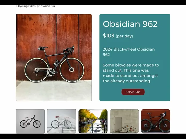
Bike Selector Page
Here is where the user reviews the bike and its features.
New City Cycles
This is a video of me going through the Hi-Fidelity redesign of the original site.
🚲 Conclusion.
♻️ Reflection & Next Steps
This project taught me that “I am not the user.”
I can think like one, but true design empathy requires stepping outside my own assumptions. This project taught me to employ the same method that someone in construction would use: "Measure twice, cut once". (Or, in this case, measure three times!) My idea of having multiple checkout options was a good idea to me but may have been even more confusing to the user.
I knew that the feature would still have a use, though. So instead of scrapping it entirely, I found a place for it on the homepage for the user to interact with, as needed. User feedback was a redirection, not a rejection of my ideas.
Overall, I'm thrilled with how my design turned out. I have more than a few ideas for where this can go next. Such as:
What I’d Do Next:
Conduct A/B testing on “Reserve by Date” vs. “Reserve by Bike” flow.
Prototype a “Buy” or “Rent-to-Own” expansion.
Explore real-world usability testing and integrate user analytics.


Home Page - Top
Here is the introduction to the City Cycles site.
Right at the top users get to choose which style of bike suits their needs!

Home Page - Bottom
Toward the bottom of the page users get to see reviews, bike brands and get the option to buy a bike they love!
Thanks For Reading! 🚲
Portfolio
Related Projects

💼 Financial Database Redesign - UX/UI Web
Reduced data retrieval time by 25% and cut input errors by 20% through streamlined workflows and a cleaner, more intuitive interface for high-volume portfolio management.
View project

📱 WAHT (We Are Happy Together) :
IRL Connection App - UX/UI Mobile
How I transformed scattered social habits into intentional in-person connections through simplified discovery, interest-aligned events, and behavior-based nudges for shy or inconsistent users.
View project