

📱WAHT (We Are Happy Together) : IRL Connection App - UX/UI Mobile
How I transformed scattered social habits into intentional in-person connections through simplified discovery, interest-aligned events, and behavior-based nudges for shy or inconsistent users.
(Conceptual case study created to demonstrate real-world UX thinking and community-driven product design. Metrics are theoretical projections used to show potential impact.)
Client
We Are Happy Together (WAHT)
Role
Lead UX Designer, User Researcher, Product Strategy
Collaborator (s)
Donát Ötvös - CEO of WAHT
Mobile UX Strategy
Emotional Design & Community Building
Design Systems Development
📱Does Social Media Still Help Us Stay Social?
🧭 Connection In Crisis
Challenge:
Despite living in large, diverse cities, people are struggling to make real, lasting connections. Existing platforms push endless content, not community This leaves users overwhelmed, lonely, and disengaged.
Objective:
Help people meet in small, low-pressure, interest-aligned groups
Reduce flakiness and ghosting by giving users gentle, contextual nudges
Make social discovery feel human, not algorithmic
Replace “performative online presence” with authentic, in-person engagement
Projected Impact:
↓ 30% reduction in event ghosting
↑ 40% increase in small-circle engagement
↑ 50% boost in first-event attendance
↑ Higher long-term community retention

📖 From Isolation to Intentional Connection
What’s working — and what isn’t?
People want community. People need community. But the digital tools meant to connect us often make things worse.
Common patterns surfaced early:
“I want to meet people who like what I like — not random strangers.”
“I’m tired of apps that feel like dating apps in disguise.”
“I bail on events because I get overwhelmed.”
The vision for WAHT became clear:
Make real-world connection feel safe, easy, and authentic — especially for people who hate traditional social apps.

Common patterns surfaced early:
“I want to meet people who like what I like — not random strangers.”
“I’m tired of apps that feel like dating apps in disguise.”
“I bail on events because I get overwhelmed.”
Vision for WAHT: Make real-world connection feel safe, easy, and authentic — especially for people who hate traditional social apps.

WAHT Landscape Map
Finding a way to translate connections online to in person and establish real connections is pretty tough.
📱Is There A Better Way To Be Social Online?
🔍 Identifying the Gaps
Interviews with four early users — Soraya (designer), Harold (transplant to a new city), Lena (introverted creative), and Kai (event lover but socially inconsistent) — revealed repeating friction:
Key Findings:
1. Endless Choices → Decision Paralysis
Users were overwhelmed by event lists that felt random and unfiltered.
2. Social Anxiety & Ghosting
People wanted to show up — but often didn’t.
Not because they didn’t care, but because they got overwhelmed.
3. Unclear Body Language & Vibes
Dating apps commodified personality traits.
People were craving real-life signals.
💡 Insight:
The problem isn’t lack of events — it’s lack of alignment, support, and clarity.
Users needed a way to see “people like me” and “events for me” without performing for an algorithm.

💡 Insight: The problem isn’t lack of events — it’s lack of alignment, support, and clarity. Users needed a way to see “people like me” and “events for me” without performing for an algorithm.

A Social Butterfly In A New Environment
Based on the input from extroverted users, I created this persona highlighting their goals and pain points.

A Homebody In Need Of Real Connection
I created this based on the input from introverts also highlighting their goals and pain points.
📱Thinking Through A Solution.
⚙️ Designing A New Version of Social Media
🎨 Design Goals
Make event discovery calm, not chaotic
Surface interest-aligned connection
Help shy users commit with low-pressure nudges
Build trust through transparency and small group dynamics
🧩 Solution Highlights
Interest Tiles:
Users choose interests (e.g., anime, food, queer cinema, hiking).
The app uses these to surface curated micro-events — not random invites.
Small Circles:
Groups capped at 6–10 people.
This dramatically reduces pressure and makes connection more organic.
Pre-Event Nudges:
Friendly prompts like:
“Still in for tonight’s gallery run? Want outfit inspo?”
(Not pushy — just supportive.)


WAHT Opportunity Map
These are the areas I identified where WAHT could fill in the gaps.

Early Mid-Fi Prototype
My collaborator, Donát Ötvös designed this prototype. It became the basis for my later design.
“How will WAHT prevent burnout for introverted users?” &
“How do we support people who want deeper connection, not just events?”
-Harper Lin, Senior UX Director
💬 Questions That Changed the Direction
In a feedback session with Senior UX Director Harper Lin, two questions reshaped the roadmap:
“How will WAHT prevent burnout for introverted users?”
→ Result: Added “Low-Energy Mode” recommending smaller, calmer events based on behavior.
“How do we support people who want deeper connection, not just events?”
→ Result: Added Interest Circles, growing from events into communities.
These pushed WAHT toward a more holistic ecosystem — not just an event finder, but a relationship builder.
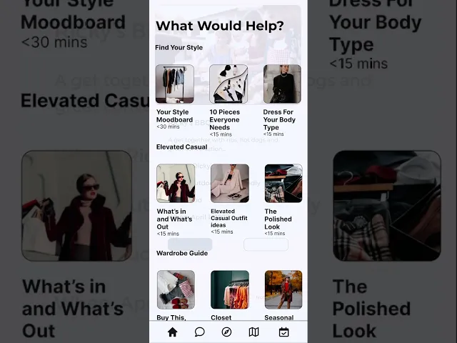
📱High Fidelity Prototypes

Homepage
On this page, the user can scroll through events for the month, add events, posts, and search content on the app.

New Event Page
This page is where users can add the details for their events.
🔁 What I Learned
This case study reinforced that social tools must do more than facilitate meeting up — they must support people’s emotional realities. As the type of introvert who will agree to go to events, dread it the week of and will likely cancel last minute, I know that its important to facilitate real connection. Though connections can be made through social media, meeting people in person is an underrated and essential part of giving those connections a real foundation. Helping to create this app took a lot of work and a lot of time but if it makes us all more social and less lonely, I hope I get to spend a lot more time making it even better!
Key Takeaways:
Loneliness isn’t solved with scale — it’s solved with signal clarity.
Digital connection apps need a human, not algorithmic, personality.
Behavioral design is essential for reducing social anxiety.
Future Plans for the App:
Time Outs - If a user bails too many times, they'll be paused on the app for a short time. If they attend an event, their account will reactivate.
Integration with larger events like Pride, University and Corporate Events, and other events.
“Vibes” Tags - Clear descriptors (e.g., Chill, Introvert-Friendly, High-Energy). Users know what to expect before showing up.

📱Some Additional Work I've Done.

Original Logo
In addition to the app design, I also made some changes to the logo. My first question upon seeing the logo was "What do the letters stand for?" Not only that, I felt the original was too corporate and not very engaging.

Revised Logo
In my opinion, adding the name of the company spelled out in the form of a smile and an outline of the logo made the logo a little less corporate and a little more fun.
Thank You For Reading!📱
Portfolio
Related Projects

🚲 City Cycles Website Redesign - UX/UI Web
How I designed a responsive, intuitive interface that reestablished user trust, simplified the booking flow, and boosted overall engagement.
User Flow Optimization
Information Architecture
Customer Experience
View project

💼 Financial Database Redesign - UX/UI Web
Reduced data retrival time by 25% and cut input errors by 20% through streamlined workflows and a cleaner, more intuitive interface for high-volume portfolio management.
View project