💼 Financial Database Redesign - UX/UI Web
Enterprise UX Optimization
Data Visualization & Interaction Design
Workflow Simplification
💼 So Here's The Problem.
🧭 Dashboard Difficulties
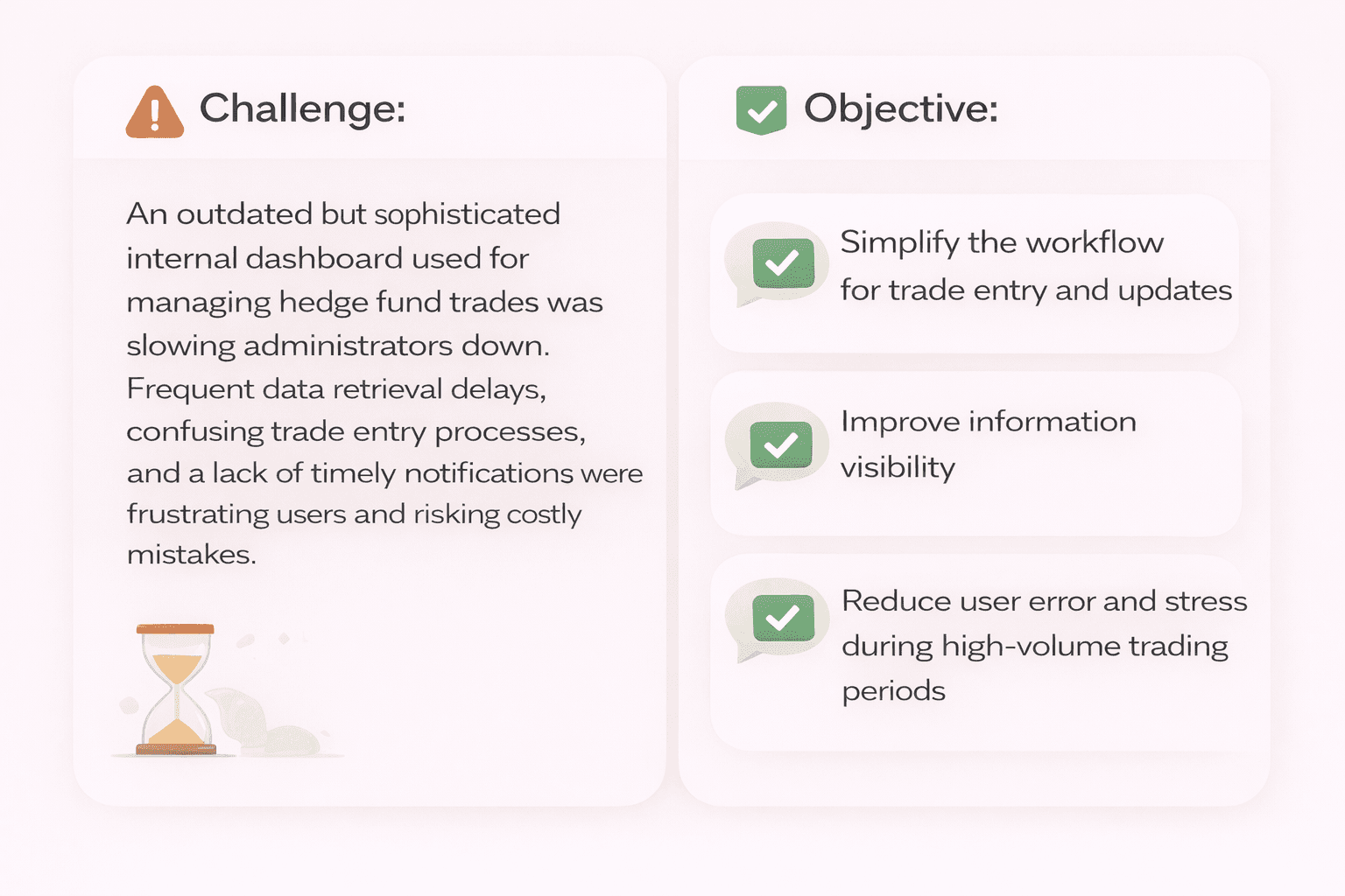
Challenge:
An outdated but sophisticated internal dashboard used for managing hedge fund trades was slowing administrators down. Frequent data retrieval delays, confusing trade entry processes, and a lack of timely notifications were frustrating users and risking costly mistakes.
Objective:
1) Simplify the workflow for trade entry and updates
2) Improve information visibility
3) Reduce user error and stress during high-volume trading periods

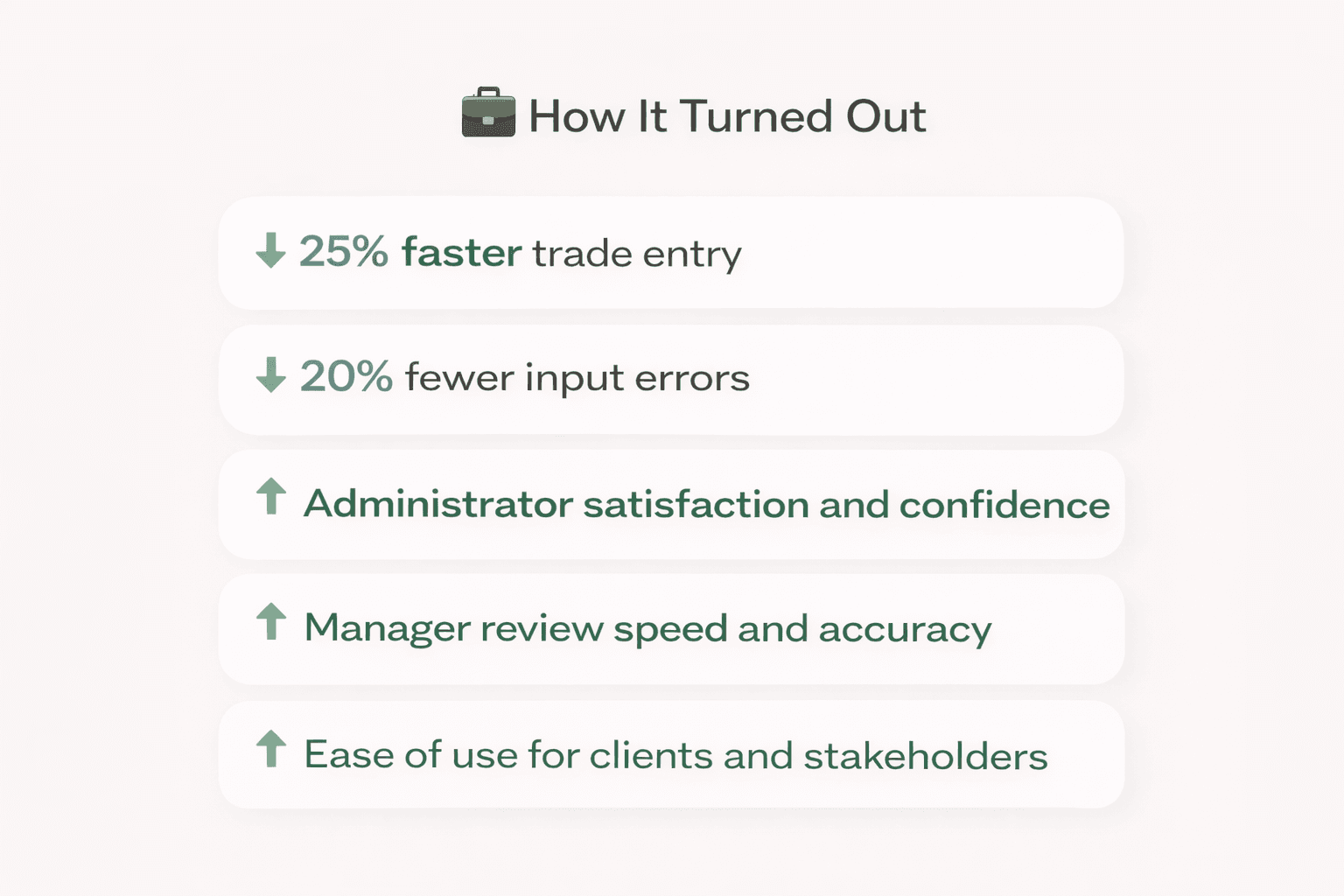
💼 Projected Impact.
💼 Let's Hear It From The People.
📖 What Do The Users Say?
What does dashboard do well — and where can it improve? The internal dashboard had been a cornerstone for trade processing and data maintenance for years. It is used by my team in Fund Order Processing, as well our overseas teams, Accounting, Auditing, and many others. But as an administrator who’d worked with it daily for nearly six years, I knew there was room to evolve.
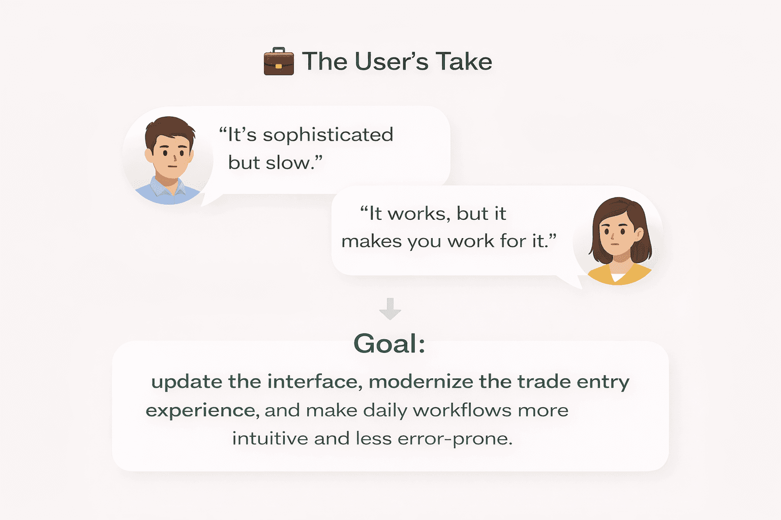
“It’s sophisticated but slow.” - One user.
“It works, but it makes you work for it.” - Another user.
Goal: update the interface, modernize the trade entry experience, and make daily workflows more intuitive and less error-prone.
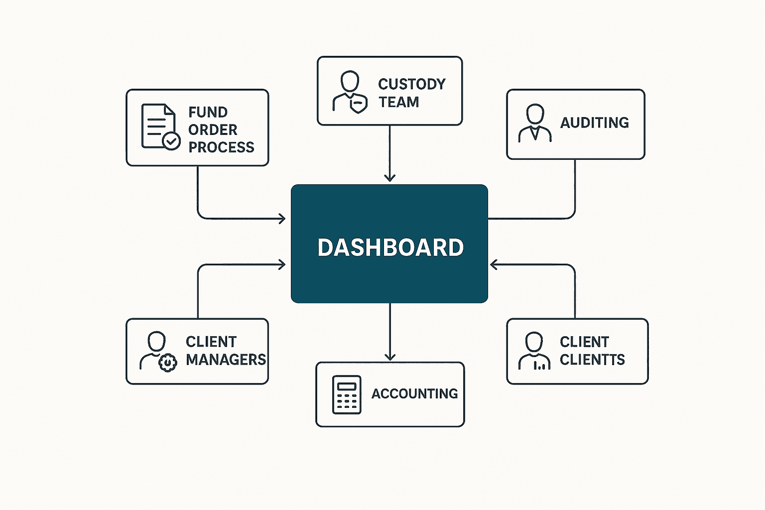
Dashboard's Place in the Ecosystem
Though my perspective of dashboard comes from my role in the Fund Order Processing team, it is utilized and accessed by many teams including our accounting, overseas custody reporting and our client support teams.
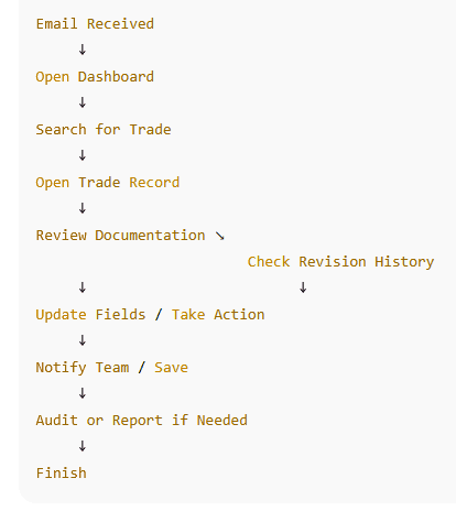
Current Workflow
Using the current workflow (in this case, for a user checking a trade for revisions) I was able to see how difficult it was for a user to find those updates in order to process changes to trade documents.
💼 Early Research.
🔍 Identifying the Gaps
Through conversations with two key users — Angie (administrator managing multiple clients) and Ralph (senior administrator managing a team) — several friction points became clear:
Key Findings:
Information visibility: Updated trade data was difficult to locate, slowing revision cycles.
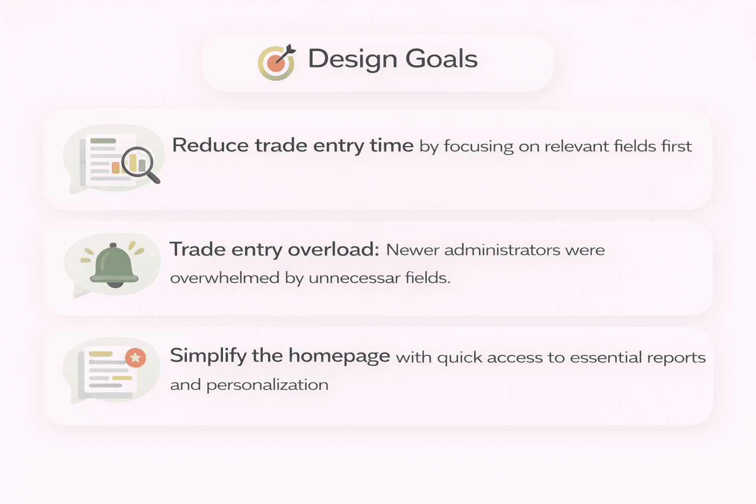
Trade entry overload: Newer administrators were overwhelmed by unnecessary fields.
Lack of notifications: No reminders to update wiring instructions or follow up on aging trades.
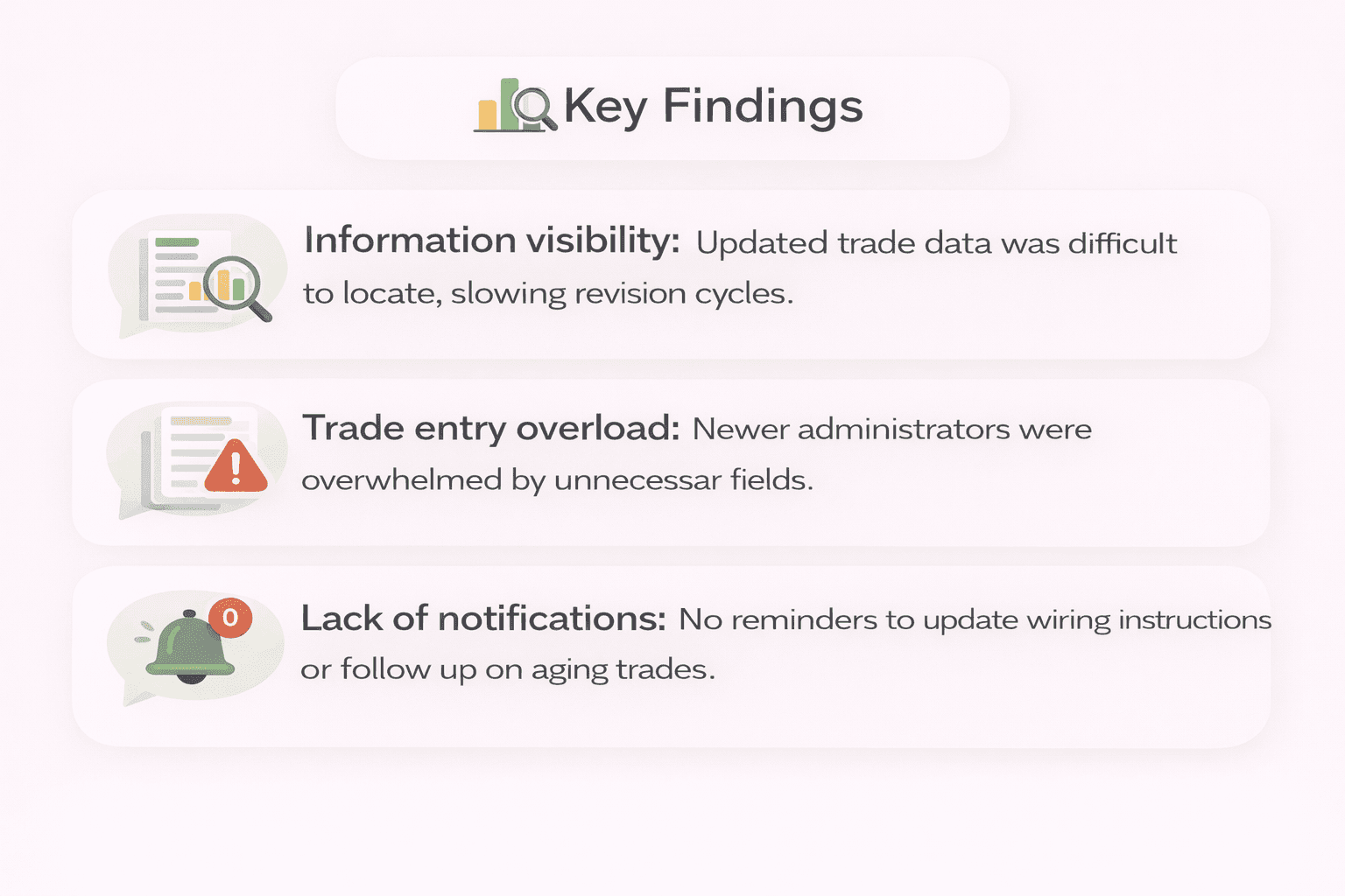
Insight: The core issue wasn’t data volume — it was data discoverability and timing.
So What Does A Dashboard User Need?
A way to surface the needed information quicker while running into as few dead end in as few clicks as possible became a very important part of my design.
💼 How Do I Approach This Issue?
⚙️ Designing the Solution
🎨 Design Goals
Reduce trade entry time by focusing on relevant fields first
Introduce timely notifications and revised trade reports
Simplify the homepage with quick access to essential reports and personalization
🧩 Solution Highlights
Progressive entry: Only necessary fields shown at first; secondary fields appear later.
Homepage metrics: Added “Revised Trades” and “Updated Wiring Instructions” as instant reports.
Side-panel notifications: Easily viewed without obscuring data.
Personalization: Added profile section to increase user ownership and engagement.
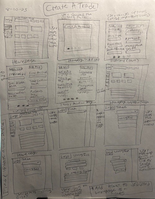
Create A Trade - Lo-Fi Design
One of my sketches for how a new design could look simplifying the process of adding a trade.
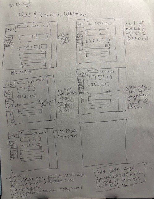
Find And Download Workflow - Lo-Fi Design
Another lo-fi design for finding and downloading workflows.
“Why this, and why now?” -Senior VP, "Financial"
💬 Two Questions That Stopped Me Cold
I had an opportunity to present to my revised design to a second VP. She had been a part of the company at the inception of the Dashboard system. I prepped her as much as I could beforehand due to the fact that she was coming into the project cold and was unfamiliar with my ideas for a redesign. While presenting to a Senior VP, I was met with two unexpected but pivotal questions:
“Why this, and why now?”
Answer:
Because the dashboard had failed me — and my peers — too many times.
With the skills to improve it, I saw an opportunity to make everyone’s jobs easier, faster, and less stressful.
After reviewing the prototype, the VP’s feedback led to two critical additions for future versions:
A review queue for senior leadership approval.
A cross-team audit with overseas departments to consolidate or remove redundant sections.
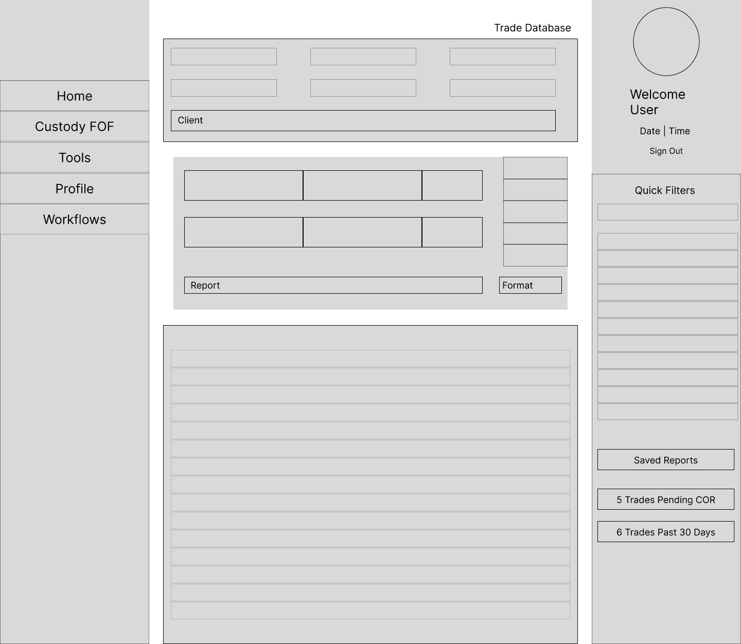
Mid-Fi Design
Once in Figma, I laid out how each segment of the dashboard homepage would look.
First Hi-Fi Design
It's rough, I know. But this was my first attempt at the Hi-Fi design.
🫣 Then The Bombshell
While most of her feedback was very positive, the Senior VP that I presented to was privy to some high level updates that the bank was implementing. One such update I had heard about in passing but wasn't made aware of how it would affect my day to day responsibilities. When sharing my take on an updated trade addition flow she communicated one such change that caused threw me off track.
"The bank is attempting to move away from manual processes."
I understood the necessity of making things automated to decrease risk in the event of an error. Having transposed a digit or two in my day, the transition made sense. But when it came to my design, it meant that my trade addition task flow wouldn't be needed or practical in the new version of the application.
✨And The Opportunity Emerged
"If manual processes were being phased out, what about for payment information?"
This was the question that I posed to her once after she revealed this update. Up to this point, that process had been manual with admins, managers, and the like entering the banking information for funds and submitting them to the system ahead of any trades requiring payments to be dispensed. In my opinion, that process should be one of the first to move from manual to automated, since incorrect payment information has been the cause of many a delay when it came to trade processing.
After considering my question for a moment, the Senior VP noted that the process would need imagining, since the process had not yet been devised. This gave me a new opportunity and a new goal:
Design the payment information upload sequence to accommodate for the phasing out of manual processes.
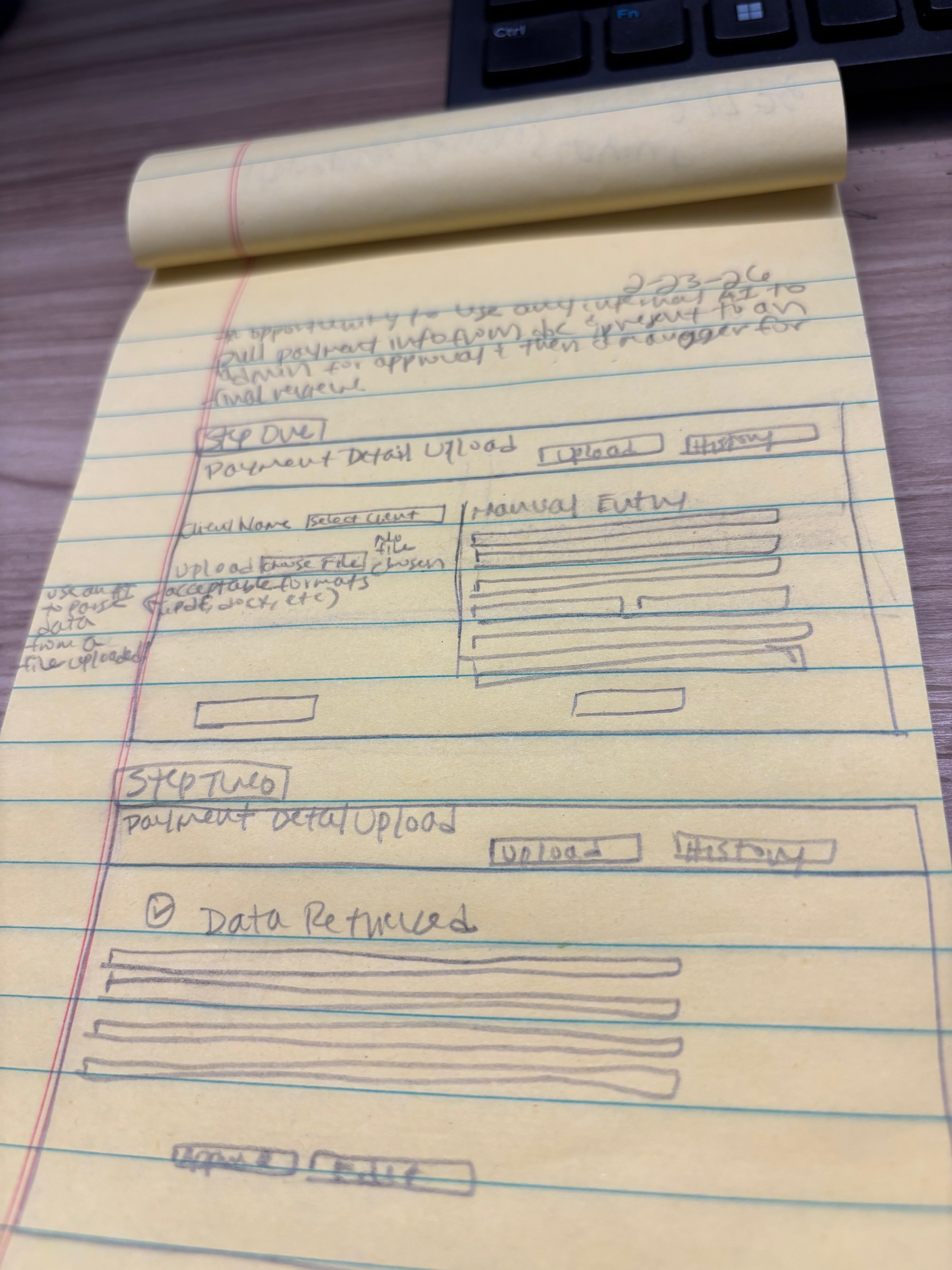
Low Fi Sketch
Some early sketches of what the first few steps would look like.
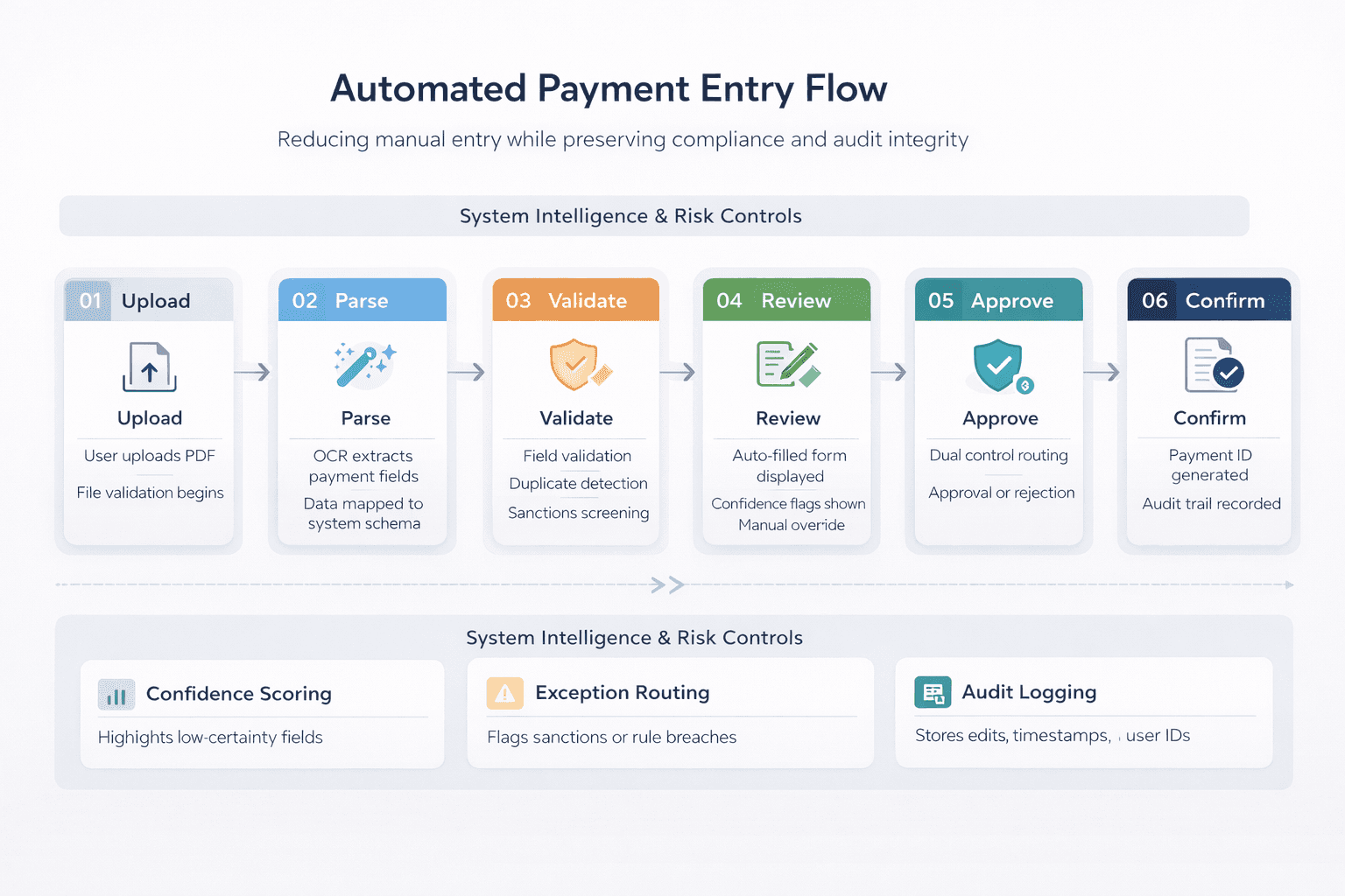
AI Assisted Pathway
Using AI, this is the plan for the build out of the payment detail upload sequence, once complete.
💼 Key Takeaways.
🔁 What I Learned
This dashboard that I have worked with for six years has been a mainstay in my department long before I came along. Though it comes with its difficulties, it is essential to my everyday work and retains a great deal of vital information. As a user, I know all of this very well.This process has taught me to appreciate this program for the information repository and complex system that it is.
That said, I also know that there are many ways where dashboard can surface insights quicker and provide updates that make the daily work that I do simpler. My hope is that I've designed something that can be easily integrated into the ecosystem and can help every team who uses this program for daily work. If there are ways that it can help other teams that I'm not privy to at the moment, my hope is that I'll get the chance to make it better for everyone.
Lastly, I learned that improving systems that everyone uses (and everyone has their own personal gripes with) should always be a team project. Had I known that manual processing for trade entry was being phased out, I would have known where to direct my energy with the redesign. Looping in more people and more perspectives should have been my intention from the beginning. But with this knowledge came a new opportunity to improve the system. For that, I'm grateful. 😊
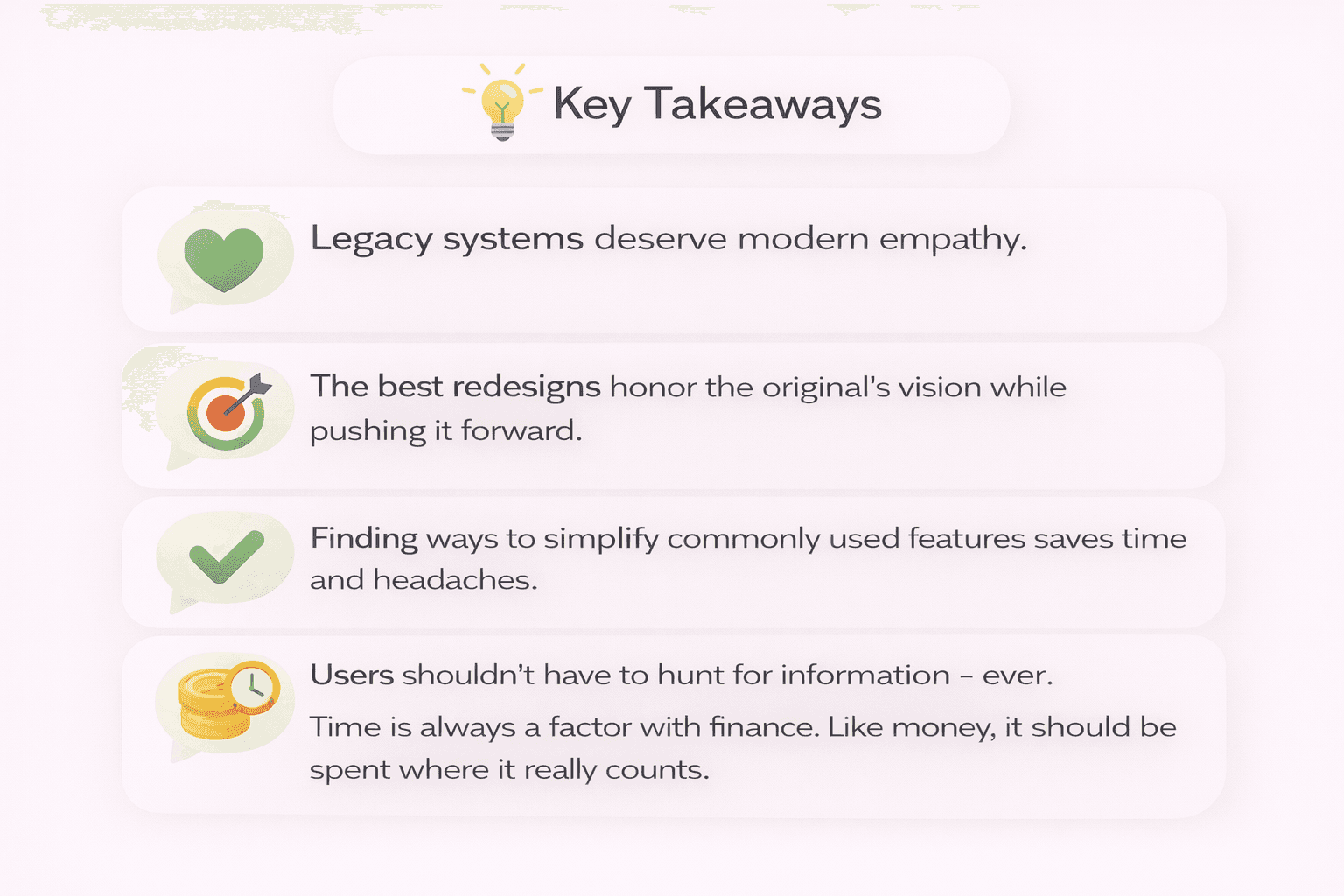
Key Takeaways:
Legacy systems deserve modern empathy.
The best redesigns honor the original’s vision while pushing it forward.
Finding ways to simplify commonly used features saves time and headaches.
Users shouldn’t have to hunt for information - ever.
Time is always a factor with finance. Like money, it should be spent where it really counts.
Collaboration from the beginning can reduce headaches at the end.
💼 High Fidelity Designs.
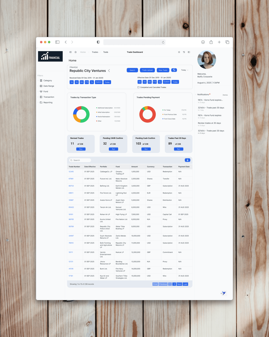
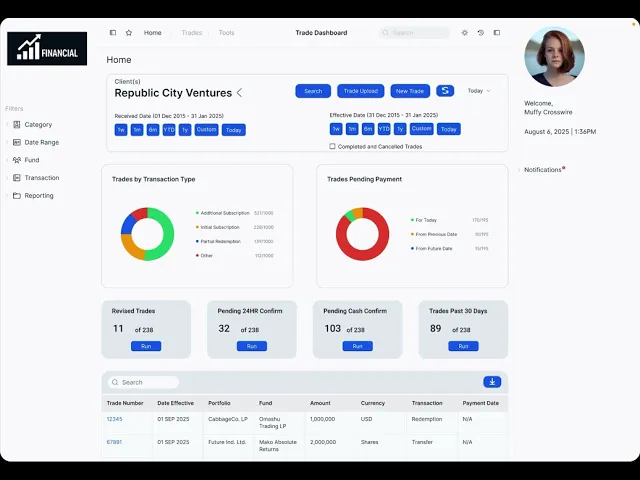
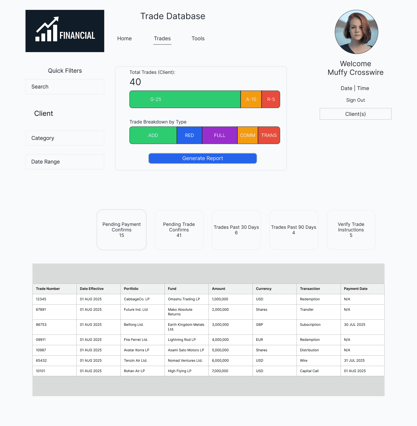
Final Product
Above is my product's final form (for now). It includes a small icon of the user in the top right of the screen, a list of notifications (added by the user) and buttons in the middle that allow the users to pull reports corresponding directly to the trades that the user is responsible for.
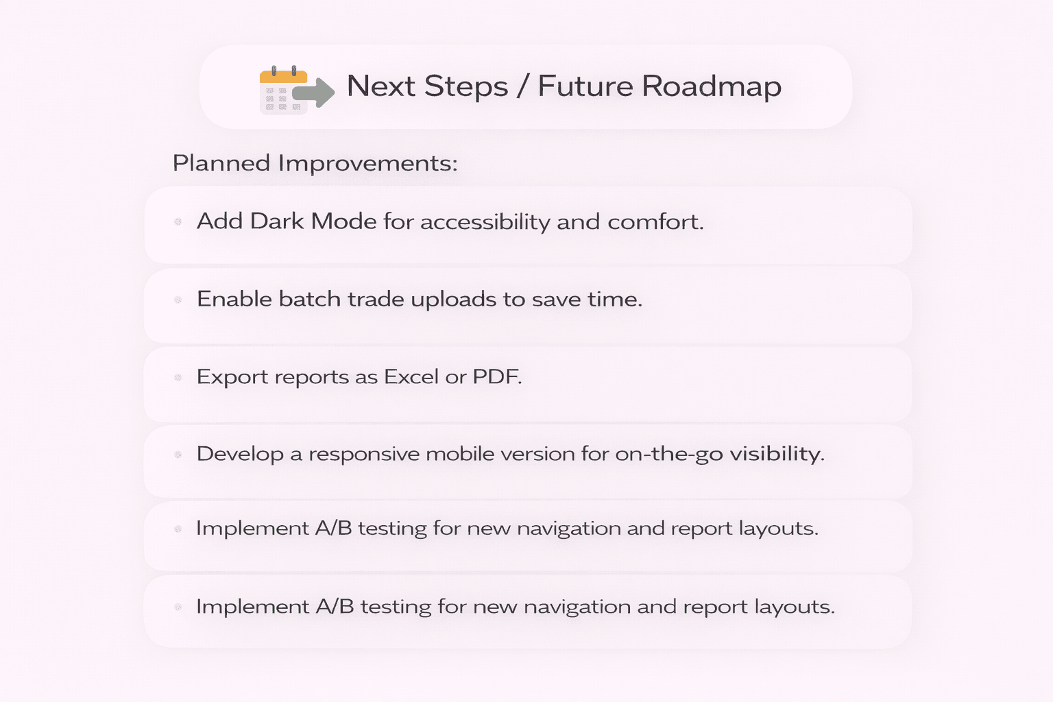
🚀 Next Steps / Future Roadmap
Planned Improvements:
🌓 Add Dark Mode for accessibility and comfort.
📥 Enable batch trade uploads to save time.
📊 Export reports as Excel or PDF.
📱 Develop a responsive mobile version for on-the-go visibility.
🔄 Implement A/B testing for new navigation and report layouts.
💼 Database Happy Path
Thanks For Reading! 💼
Portfolio
Related Projects